

Kanelis Lab
I revamped the Kanelis Laboratory's website, increasing user engagement by 62% (bounce rate of 34.5%) and the average number of pages per session to 2.3.
Role:
Solo UX Designer & Web Developer
Timeline:
5 months
Client:
Kanelis Research Laboratory
Methodologies:
Competitive Analysis, Information Architecture, Iterative Prototyping, Design System
The Kanelis Research Laboratory is a tight-knit team of 7-10 people who study protein structures and functions. They needed a new website that effectively communicated its research, team members, resources, and available positions.
The primary audience for this platform was prospective students, including both undergraduate and graduate candidates, who were seeking insights into the lab’s main focus and academic opportunities.

IMPACT:
Key analytics since 1 month of launch:
62% decrease in bounce rate (percentage of people who leave without taking action)
133% increase in averages per session (indicating user engagement and navigation ease)
260% increase in average session duration with most users reading through the research page
45% of visitors navigate to Positions Available indicating key audience is interested in applying
The Process
Discover
Define
Develop
Deliver
I looked at other university research lab websites to identify best practices in structure, navigation, and content presentation.
I found some common issues in outdated lab websites, such as cluttered navigation and hard-to-find content. The best websites prioritized clarity and a professional yet approachable design to improve user experience.


Improve Navigation
Create a clear, logical structure for visitors to easily find information.
Enhance Readability
Optimize layout, typography, and contrast.
Streamline Content
Organize research, publications, and lab member details in an easy-to-read format.
Simplify Maintenance
Select a platform that allows the client to update content quickly.
Using insights from my research, I mapped out a sitemap and connecting links to get the overall structure of the website. I kept the navigation simple, with clear distinct labels and categories.

Since the target audience was prospective students, I made sure it was easy for them to find information about what the lab does, who the team members are, and how to get involved.
I developed 2 very rough low-fidelity wireframes to visualize the layout and content hierarchy. Afterwards, I asked the internal team for feedback.
A

B


The revised design combined the best sections of both wireframes and cut out unnecessary, repetitive information.
To ensure consistency, I developed a design system forked from Bold Design System that adhered to the University of Toronto's branding guidelines while allowing for the lab to stand out.

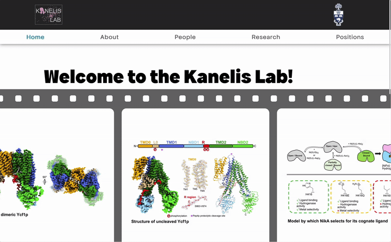
Interactive Homepage
The previous homepage was just a dense paragraph about the research focus. This would be too overwhelming and hard-to-digest for users who are quickly looking through multiple lab sites.
I simplified the design so it summarizes the
research focus and hooks the user with an
interesting slider of diagrams.
Quick Contacts
Potential graduate students who might want to reach out to members now have a way to do so.
This also helps current members keep track of each other's contacts.


Direct Links for Applying
I noticed many other labs only mentioned emailing the instructor. However, this can lead to a lot of back and forth between the instruction and all interested applicants.
To prevent this, the position descriptions are more detailed and include external resources so applicants can learn more about the requirements and process before sending an email.
Once the design was approved, I brought the site to life using Wix, which allowed the site to be easily maintained by others.
One of the biggest challenges was translating the design into code. A few design choices were just not available on the platform, so adjustments had to be made. I did not want to introduce custom code into the website as it would complicate the system.
Visit kanelislab.org
To clearly understand what the instructor was envisioning, I asked a lot of questions in the beginning: Who's this website for? What parts did you not like from the past site? What adjectives would you use to describe the final ideal website? Do you have any examples of website you like? This helped me narrow the scope of the design and ensure all stakeholders were accounted for.